Welcome to Excel Avon
How to create Waterfall chart in Excel
DOWNLOAD THE USED EXCEL FILE FROM HERE>>
In today’s post we will explain How to create Waterfall chart in excel. As I tell you, there is a waterfall chart in Excel. This is a special type of column chart that is used to show how the starting state of a certain data series changes over time, whether it increases or decreases. In a waterfall chart, the first column represents the first value, while the last column represents the last value. In total, they represent the total value. It’s Great for tracking inventories, checking accounts, calculating revenue and More!
Microsoft introduced Waterfall Excel charts in Excel 2016. Unfortunately, the Waterfall chart type does not exist in 2013 or earlier versions of Excel. So today in this article, I will explain How to create Waterfall chart in Excel step by step with pictures.

Create Waterfall chart in Excel
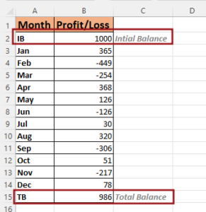
As we have data in a table, now in this data losses are visible in many months and profit in some, but we want to create a waterfall chart to display this data and do color formatting as per our choice in the waterfall chart. As we told you, the first column represents the first value, while the total represents the total value. So in our data sheet also the first value is like Initial Balance and Total Value is below

Now select the data table and then go to the Insert tab and here you insert the waterfall chart as you can see in the picture below.

After inserting the chart, you can make some changes in it like changing the title of this chart, if you do not want to keep it then you can also delete it.

Now as in the chart, the value bars of total balance and initial balance are in the same color, we want to have a different color for this. First of all, right click on Bars set as total, Total and initial balance.

Now as the legends are visible in the chart, you can select the color of the increase and decrease bars by selecting these legends. When you select the legend, do color formatting one by one.

Now to format the axis, right click on the axis and then go to Format Axis option.

Add the tick mark in the axis which will be major and minor. Major type tick mark will be selected outside, and minor type tick mark will be also outside.

Now we will go to the fill option, here we will fill the axis line solid and by selecting the color black, we will increase its thickness (width).

Now we have to format the month axis. Add tick mark in the axis. Major type tick mark will be selected outside, and minor type tick mark will be also outside.

As we did the fill color for the upper Y axis and increased the line width, do the same here. So go to the fill option, here we will fill the axis line solid and by selecting the color black, we will increase its thickness (width).

Now our waterfall chart is ready.

Therefore, I hope that you have understood How to Create Waterfall Chart in Excel, maybe if you do not understand anything, then you can comment us with the question, which we will answer soon and for more information, you can follow us on Twitter, Instagram, LinkedIn and you can also follow on YouTube.
DOWNLOAD THE USED EXCEL FILE FROM HERE>>
LEARN MORE DASHBORAD AND CHART TOPIC HERE
You can also see well-explained video here about How to Create Waterfall Chart in Excel


