Welcome to Excel Avon
Conditional waffle chart in Excel
DOWNLOAD THE USED EXCEL FILE FROM HERE>>
In today’s post we will explain how to create a conditional waffle chart in Excel. As I explained you, to create a waffle chart in Excel we have to use a 2-D bar chart because no waffle chart exists in Excel, Excel waffle charts are a popular way to display parts of a whole. today we will use a 2-D clustered bar chart to create a waffle chart. Waffle charts are square or rectangular displays made up of small squares in a grid pattern.
Most commonly, it is a 10 x 10 grid, but they can be any dimension you want them to be, and this will depend on the data you are looking to display. Each square within the grid is colored based on a category and represents a portion of the whole. From these plots, we can see contributions of individual categories.
Waffle charts are a great way to visualize categorical data, are aesthetically pleasing and easy for readers to understand — which is one of the key goals of effective data visualizations. They also provide a nicer looking alternative to pie charts.
So today in this article, I will explain How to conditional Waffle chart in excel step by step with pictures.
Well, as you can see, our conditional Waffle chart to be like this.
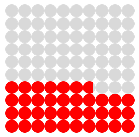


Create conditional waffle chart in Excel
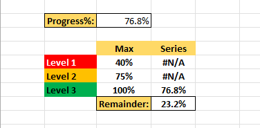
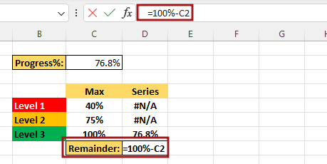
As today we are going to create a conditional waffle chart where there is data like this, this data is divided into three parts: Level 1, Level 2 and Level 3. We fixed the value of Level 1 from 0 to 40. Is. If the value in progress cell is between 0 to 40 then it will be considered as level 1 and after that for level 2 we have fixed it from 41 to 75 and then after level 2 for level 3 we have fixed it from 76 to 100. As you can see below.
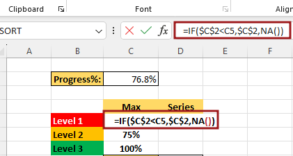
Now we will add condition in the cell for level 1 if the value of C2 is less than C5 then the value of C2 will come otherwise the cell is NA. also make C2 absolute cell.
Now we will add the condition in the cell for level 2. Here we are adding two conditions if the value of C2 is Greater than C5 and C2 is less than or equal to C6. if both the conditions are true then the value of C2 will come otherwise NA. We will also add this condition for level 3 and drag it.
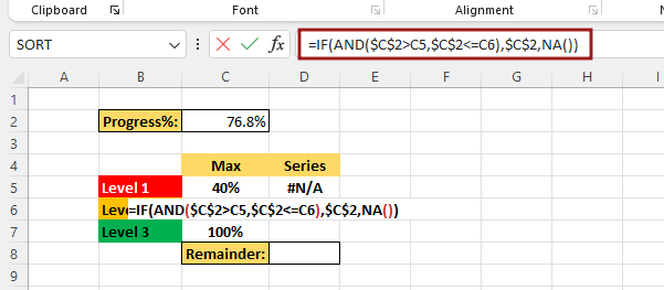
Remaining value will be obtained =100%-C2
Now we are adding some values to the worksheet. Similarly, you also add the values to the worksheet and declare the cell first in level 1, then in level 2 and then in level 3.

Now we are adding condition for Level 1 if value of D5 is greater than F9 then 10 otherwise add another condition we are adding two conditions so we have to use AND function if value of D5 is greater than F8 and if value of D5 is less than or equal to F9, if both conditions are true then value of D5-F8 will be NA otherwise. Using IFERROR: If value is true then get value by formula, value if error get blank cell. we need to this value in percentage so we will multiply 100 with C2.
=IFERROR(IF($D$5*100>F9,10,IF(AND($D$5*100>F8,$D$5*100<=F9),$D$5*100-F8,"")),"")

Now copy this formula then paste it into level 2 and level 3 cell. Now we will make some changes in the formula added for level 2. Like (D5 To D6).
=IFERROR(IF($D$6*100>F9,10,IF(AND($D$6*100>F8,$D$6*100<=F9 ),$D$6*100-F8,"")), "")
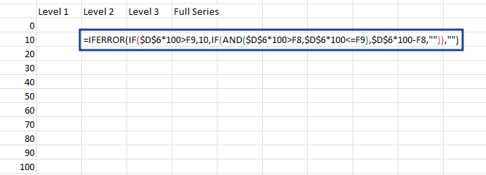
Now we will make some changes in the formula added for level 3. Now apply the formula end of the all levels range. =IFERROR(IF($D$7*100>F9,10,IF(AND($D$7*100>F8,$D$7*100<=F9),$D$7*100-F8,””)),””) Write the value as we write in the full series column

Now check the value in the column, is this condition working properly? Then without Selecting data go to Insert tab and click on insert Bars chart. insert Clustered chart from 2-D Bar.

There is no data in the chart after the chart is inserted, so now we will go to select data by right clicking.

From select data, we will click on add button and then write series name and series value here, name the series as Full Series, then select the Full Series Column cell for the series Value.

Add another data series we will click on add button, name the series as Level 1, then select the Level 1 Column for the series value.

Formatting of the series by right click on the bar.

And then we’ll decrease the gap width to eliminate the gap between the bars. make the orange bars the secondary axis.

Formatting axis by right click.

We will change the max bound from 15 to 10. also change the primary axis bound value.

Now you have to insert a shape, then you go to the Insert tab and then go to Illustration and then to Shape, then you insert an oval shape.

After inserting the shape, you drag it with shift key for perfect circle. Then fill the color with No outline.

Now the circle shape that has been created will be replaced with the blue bars of the chart by copy and paste.

To format the data series, go to the format data series option.
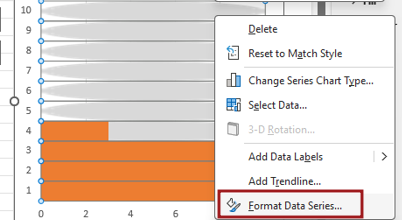
In Format Data Series, go to Fill option and select Stack and Scale with option.

Now the circle shape that has been created will be replaced by the bars of the chart. But before replacing with red color will have to be changed

After changing the circle color, we will paste it in place of the orange bars of the chart.
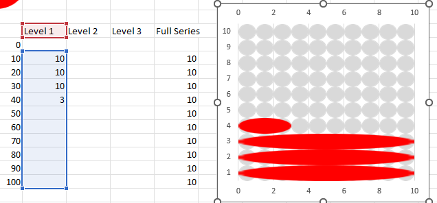
Go to the format data series option. In Format Data Series, go to Fill option and select Stack and Scale with option.

After doing Stack and Scale with, our chart will look like this.

Now we will copy and paste this chart, that is, we will make another copy of this chart.

Now select the 2nd Chart and right on chart then go to Select Data option.

Now we will edit data so Fill series data and click Edit option.

Write series name and series value here, name the series as Level 2, then select the Level 2 Column for the series value.

Then we will go to the Progress cell and change the Progress value to 65. Then we will change the color of the circle which will be for level 2.

Then going to the 2nd chart, we will replace the blue bars with circles.

Right click on the chart then go to format data series.

Go to the format data series option. In Format Data Series, go to Fill option and select Stack and Scale with option.

Now select the 2nd Chart and right on chart then go to Select Data option.

Now we will edit data so Level 1 data and click Edit option.
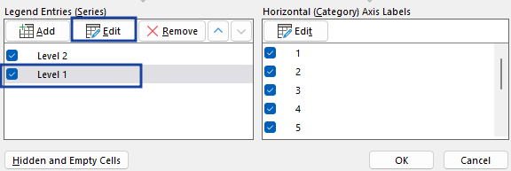
Write series name and series value here, name the series as Level 3, then select the Level 3 Column for the series value.

Now write a value which is satisfied by level 3. Then we will change the color of the circle which will be for level 3.

Then going to the 2nd chart, we will replace the orange bars with circles.

Go to the format data series option. In Format Data Series, go to Fill option and select Stack and Scale with option.

Select both charts and then remove some chart elements Axis, Gridline

Now select the 2nd chart and go to fill option Select NO Fill with No Outline.

Select Both chart and go to shape format option. Middle and center align both charts.

Now group these two charts, right click> Group.

Let’s check the chart by changing the values. Here the value of level 2 range has been filled and now you can see the chart is showing level 2.

Similarly, the value of level 1 range has been filled and now you can see the color of the chart has changed and the value is also showing. Now our Conditional Waffle chart is ready in Excel. change the value of progress cell then you can see chart has been changed.

Therefore, I hope that you have understood How to Create Conditional Waffle chart in Excel, maybe if you do not understand anything, then you can comment us with the question, which we will answer soon and for more information, you can follow us on Twitter, Instagram, LinkedIn and you can also follow on YouTube.
DOWNLOAD THE USED EXCEL FILE FROM HERE>>
LEARN MORE DASHBORAD AND CHART TOPIC HERE
You can also see well-explained video here about How to Create Conditional Waffle chart in Excel


