Welcome to Excel Avon
Candlestick chart in Excel
DOWNLOAD THE USED EXCEL FILE FROM HERE>>
In today’s post we will explain How to create Candlestick chart in Excel. If you are unfamiliar with the Candlestick chart in Excel, it is a chart you can use to represent the stock data in Excel. Analyzing stock data in a simpler manner is a big task. Because you always will have a lot of history getting generated.
Fortunately, Excel has inbuilt stock charts of different types for this purpose. One of those charts is the Open-High-Low-Close chart, also known as the Candlestick chart. This chart is usually helpful in describing the stock, currency, capital, and derivatives movements over time. It allows the user to have a clean, simple, visually attractive output that is also easy to understand. This graph allows you to have an analysis of stock and price patterns.
So today in this article, I will explain How to create Candlestick chart in Excel step by step with pictures.
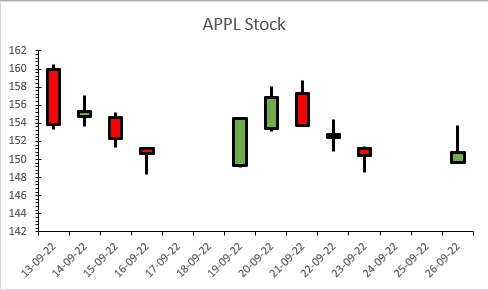
Create Candlestick chart in Excel
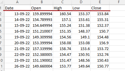
We will generate this data randomly and are just adding the data to create the chart. As we told you, this chart is also used for stock market, so we will add stock type data in it where we will keep 5 columns, first column is date, then open, high, low and then close as you can see below.
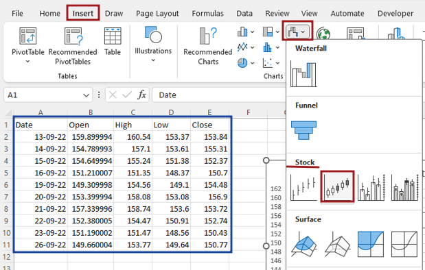
Now we’ll select whole data and then go to Insert tab and click on insert stock chart. insert open high low close chart.
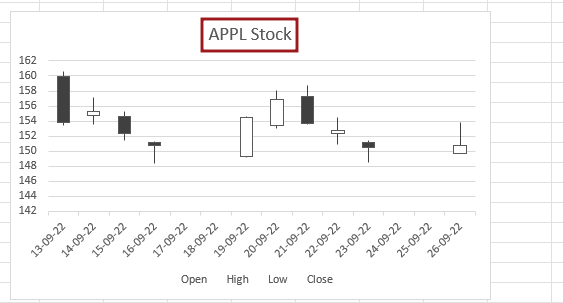
If you want to name this chart, you can name it.
Now we will do the formatting of the axis by right clicking on the axis.
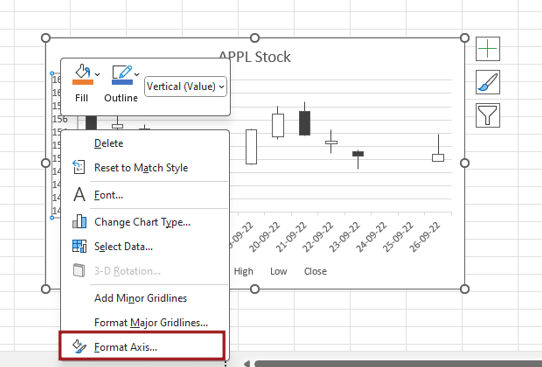
Add the tick mark in the axis which will be major and minor. Major type tick mark will be selected inside, and minor type tick mark will be selected outside.

Format axis lines and fill the color, Increase the width of the axis line.
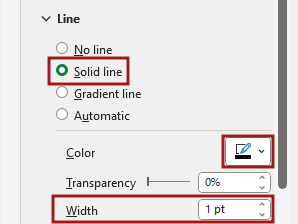
Now we will format the date axis of the candlestick chart. Select solid line and select color. Increase the width of the date axis line.

Now we will delete legend of chart, but if you want to keep them in the chart then do not delete them.
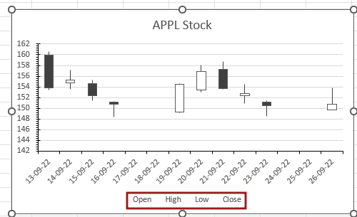
Now you have to do color formatting of up bars because both up and down bars are in the same color. So first of all, we will select the down bars and go to format and here from the fill option.
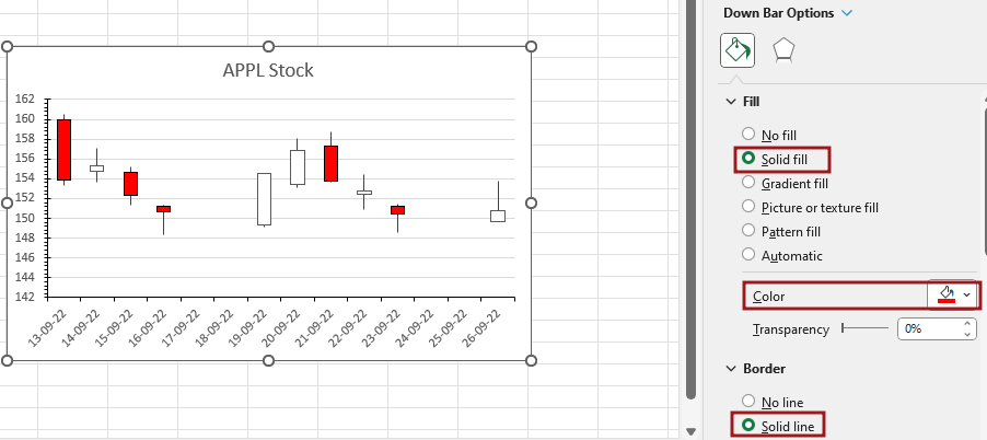
We will select solid fill and then go to color option and select red color, then select the border as solid line, fill the border color and increase the border width.

Now we will format the down bars. Select the solid fill and color for Up bars.

Now select the border as solid line, fill the border color and increase the border width.

Now we will format the line of up and down bars.

We need to remove the gridline from the chart element.
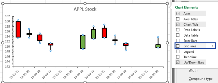
As our candlestick chart is ready. It is a conventional candlestick chart that uses stock values arranged in order as Opening value, Highest Value, Lowest Value, and Closing Value.

Therefore, I hope that you have understood How to Create candlestick Chart in Excel, maybe if you do not understand anything, then you can comment us with the question, which we will answer soon and for more information, you can follow us on Twitter, Instagram, LinkedIn and you can also follow on YouTube.
DOWNLOAD THE USED EXCEL FILE FROM HERE>>
LEARN MORE DASHBORAD AND CHART TOPIC HERE
You can also see well-explained video here about How to Create candlestick Chart in Excel


