Welcome to Excel Avon
Gauge CHART IN EXCEL
DOWNLOAD USED EXCEL FROM HERE>>
In today’s post we will show you how to Create Gauge Chart in excel, although it’s fairly simple, this will be using a pie chart along with a doughnut chart, so it’s going to be pretty easy. Gauge charts are attractive and easy. a doughnut shows the zones, and the pie section indicates the actual value. It is also known as Speedometer Chart or Dial Chart. This article will teach us to create a Gauge Chart in Excel with step-by-step procedures and explanations.
Sometimes we need to create a Gauge Chart in Excel to save our time and make our life more efficient.
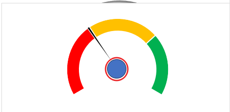
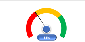
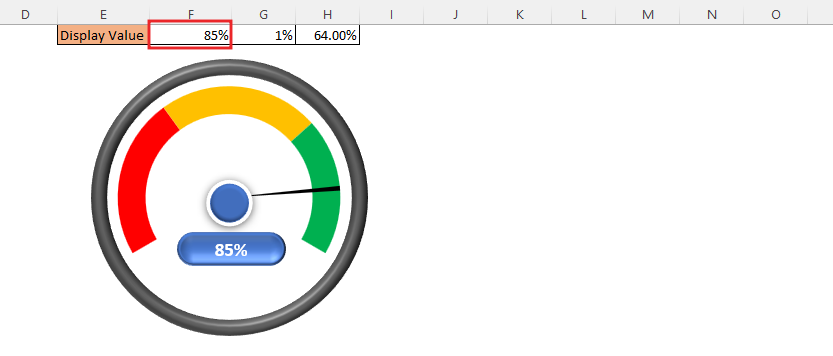
By the way, our Gauge chart is going to be like this as you can see.

Create Gauge chart in Excel
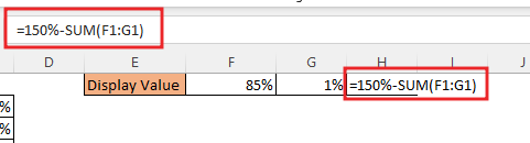
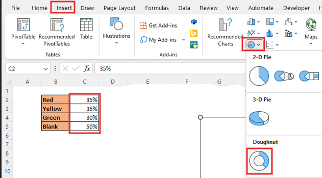
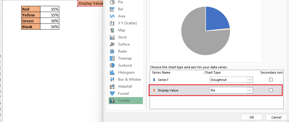
Create a table in excel sheet which will look something like this. In which there will be 4 parts red part, yellow part, green part and Rest Part. Here you have to write such a value which divides 100 into 3 parts.

As you can see here 3 values are different one is for display then one is for needle and last part will be rest rest part will have =150-Sum(F1:G1)
Select the data, go to the Insert, from here insert doughnut chart.
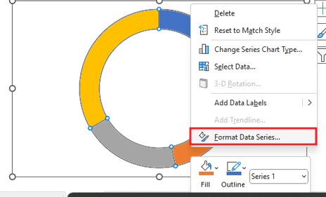
To Remove the legend at the bottom, select the legend and delete it. For changing the angle of first slice of the doughnut chart, Right click on the chart and select Format Data Series.
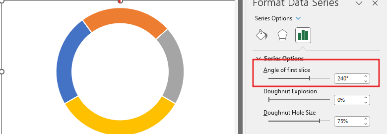
Change the angle of first slice to 240 Degree.
To remove the outline from the chart, right click on chart then format data point option. To make the full circle into Gauge circle, Right click on the bottom part(yellow) of the chart Then go to the Series Option and click No Fill.
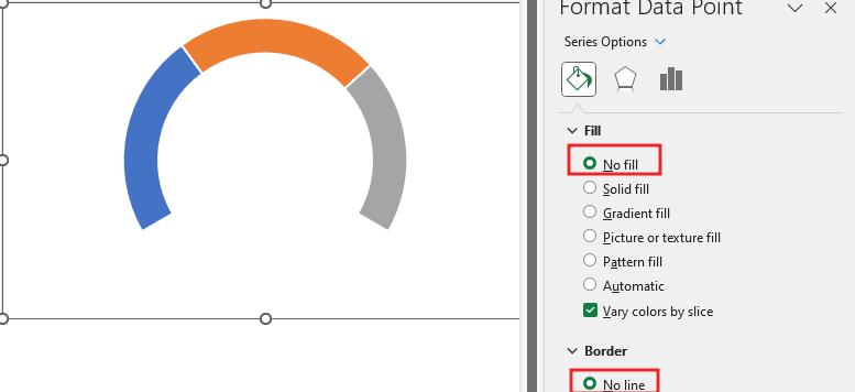
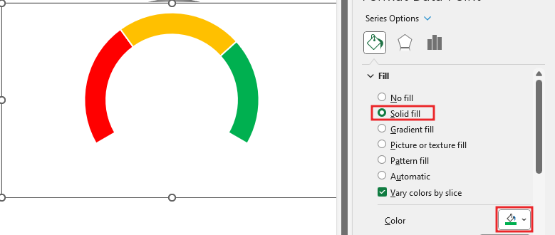
In all the parts of the chart, we will fill the color according to ourselves, although in the gauge chart first red, then yellow and then green, so we are also going to do this color formatting with solid fill in our chart.
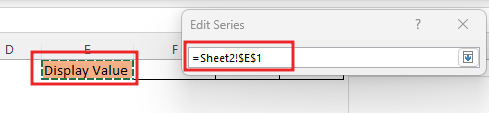
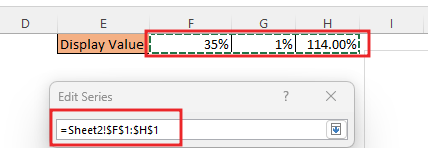
To add data, we will right click in the chart, then go to the select data option in the chart. In select data source we’ll click on Add button.


Give the name of the series as you want and give the data, as you can see, we had two tables, we will select the range of the table with the display value for the name and select the three cells in front of the display value range for the series value.
After inserting the data, we will get a chart like this.

Right click on the second chart, then go to change series chart type’. Here you will change the type of the chart.
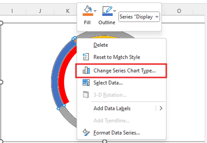
Here you will change the type of the chart. From Doughnut to pie chart.
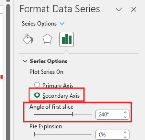
Change the direction of the needle chart that has been made. Then we will do the Data series formatting of the chart by right click on Display value chart, change the angle of first slice to 240 Degree, and select secondary Axis.
.
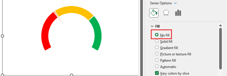
Make the value to show the blue part and grey invisible by filling no color. Here only the needle part will be kept.
Now select the needle and then fill the solid in the needle and make the border no line. And then fill the needle part with black color.

Now let’s decorate the meter, so we’ll go to insert tab, by going to the insert tab, go to the illustrations option, from here you select an oval shape.
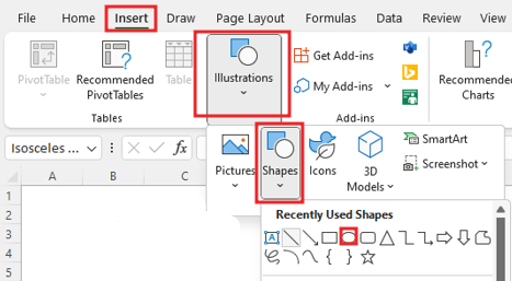
Drag oval shape in sheet with shift key
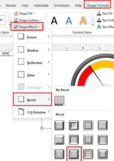
By clicking on the shape, you will go to the shape format option, from here you will add the shape effect.

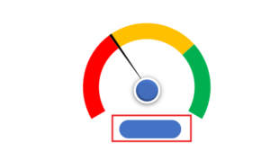
Now the chart has become very attractive in appearance, now we have to insert another shape to display the meter value in it.

Go to insert tab> Illustrations> Select A rectangle Round shape, then drag the selected shape in sheet.
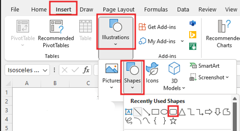
then drag the selected shape in sheet.
By clicking on the shape, you will go to the shape format option, here you go to shape outline line and select ‘No Line’ with you will add the shape effect in Rectangle shape.
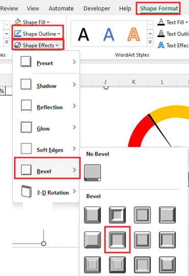
Add the formula in the shape to range of the display value. Format the value in the shape, make the text bold, align and fill color in Text value.
Go to insert tab for another shape> Illustrations> Select A oval shape.
Then drag the selected shape in sheet with shift key for perfect circle.
Click on circle then go to border option then increase the weight of border size. Make circle shape ‘No fill’.
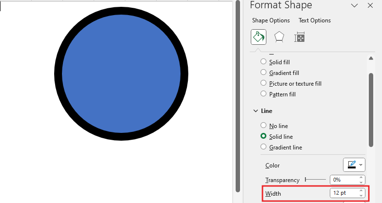
Change the color of the shape outline, then add the shape effect to the shape.
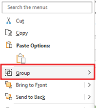
Now make the group by selecting the All elements like, Circle shape, meter display, Needle and doughnut chart.
You select the entire chart and make it No fill and then remove the gridline of the sheet as our chart already has gridline remove.
Now our gauge chart is ready, Let’s check the speedometer graph.

Therefore, I hope that you have understood How to Create Gauge chart in Excel, maybe if you do not understand anything, then you can comment us with the question, which we will answer soon and for more information, you can follow us on Twitter, Instagram, LinkedIn and you can also follow on YouTube.
DOWNLOAD USED EXCEL FROM HERE>>
LEARN MORE DASHBORAD AND CHART TOPIC HERE
You can also see well-explained video here about How to Create Gauge chart in Excel

")
")