Welcome to Excel Avon
Traffic light graph in Excel
DOWNLOAD THE USED EXCEL FILE FROM HERE>>
In today’s post we will show you how to make a traffic light graph in excel, although it is quite simple, the traffic light graph is an indicative graph. Although traffic light graph must have been seen often while driving on the road, but we will make it on this excel sheet, we can use it to indicate the loss profit or average of our business, so now let us make a traffic light chart.
By the way, our traffic light graph is going to be like this as you can see.
Create Traffic light graph in Excel
Create a table in excel sheet which will look something like this.

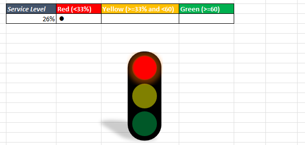
Now we will enter a value in the Service Level cell which is less than 33.

Now add condition in red cell if value of service cell is less than 33% then red cell will be filled with ‘l’ otherwise cell will be blank.

Like red cell will add condition for yellow cell will use AND function in yellow cell if value of service cell is 33% or 33%+ and less than 60% then yellow cell will be filled with ‘l’ otherwise cell will be blank.
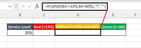
Now add condition in green cell if value of service cell is 60%+ then green cell will be filled with ‘l’ otherwise cell will be blank.

Once we check our cell, we will see if there is an error in the formula. the value is just right here.


Now we will ‘windlings’ the fonts of the red, yellow and green cells. So now the formatting of the value coming here will be changed.


Go to insert tab then click on illustrations option, then we will go to shape and insert rectangle (Rounded Corner) shape.
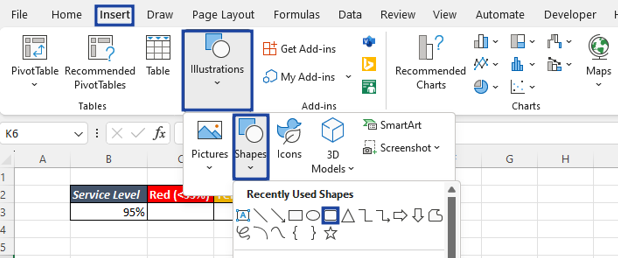
Drag the shape into the sheet and round its corner.

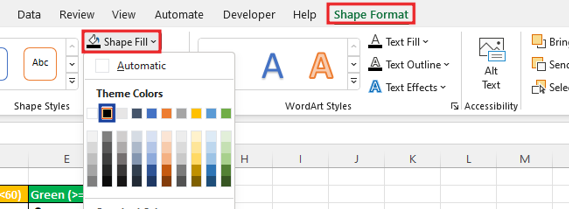
By going to shape format, we will fill this shape with black color.
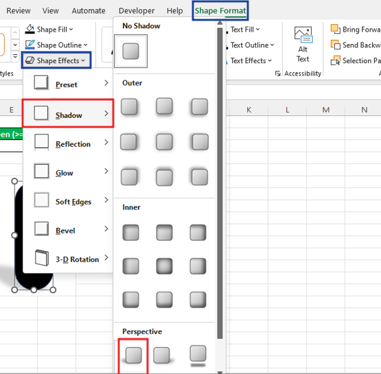
We will add effect to this shape by going to Shape Format > Shape> Shadow> Perspective.
Insert a ‘Oval’ shape by going to insert> illustrations> Shape.
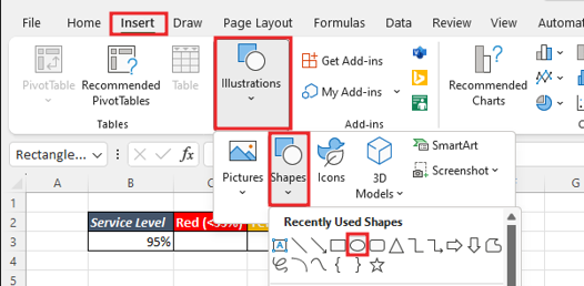
Oval shape, drag it with shift to make a perfect circle. With this, we will add the oval shape to the background made for the traffic light and fill the shape with red color. Make No outline.

Take 2 copies of this oval shape. align all three shapes by selecting of them. By going to the shape format, we will fill the second shape with yellow color and the third shape with green color.
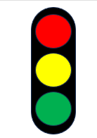
Select all three shapes, right click and click on Format object. set the transparency of the shapes to 50%.

Now we’ll insert text box by going to insert tab, Will add formula in the same text box =C3. If the service level value fulfills the C3 condition, then the text box will be filled.
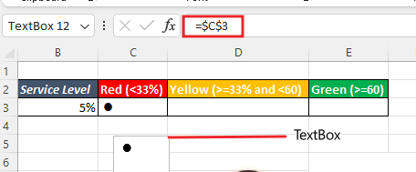
Formatting the value of the textbox. Increase Textbox size, align it, do No Outline with shape formatting.
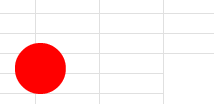
Set this Textbox perfect in the signal. 2nd picture after adding glowing effect by going to shape format.


Copy and paste red text box for yellow singles add it. Also add formula in yellow textbox =D3.

If the value of service level is 33%+ the value will be filled in the yellow cell.
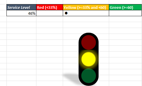
Make another copy of the text box and then add formula =E3 and color green fill in textbox along with increase the size and add the glow effect by shape effect and fit it in green light.
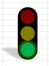
let’s check the traffic light now. Here the value is less than 33% so here the signal is red.
Here the value is increased by 33% and decreased by 60. Here the signal is yellow.

Here the value is 60+ and see here the signal is green.

Therefore, I hope that you have understood How to Create Traffic light graph in Excel, maybe if you do not understand anything, then you can comment us with the question, which we will answer soon and for more information, you can follow us on Twitter, Instagram, LinkedIn and you can also follow on YouTube.
DOWNLOAD THE USED EXCEL FILE FROM HERE>>
LEARN MORE DASHBORAD AND CHART TOPIC HERE
You can also see well-explained video here about How to Create Traffic light graph in Excel

