Welcome to Excel Avon
Spider web chart in Excel
DOWNLOAD THE USED EXCEL FILE FROM HERE>>
In today’s post we will show How to Create Spider web chart in excel, yes, it is a bit different, A radar chart in Excel is also known as the spider chart, web, or polar chart. spider web chart is used to demonstrate data in two-dimensional for two or more data series. The radar chart in Excel visualizes the performance and makes concentrations of strengths and weaknesses visible.
A Spider web chart compares the values of three or more variables relative to a central point. It’s useful when you cannot directly compare the variables and is especially great for visualizing performance analysis or survey data.

Create Spider web chart in Excel
Create a table in excel sheet which will look something like this. In which there will be 2 columns. Month and No. Of sales.

Select the data range you need to show in the chart. You can see the image below:

Click Insert > Other Charts > Radar, choose from a variety of radar chart types, and choose the radar chart type you want, including ‘Radar with Markers‘ and ‘Filled Radar’, you can see below Can see image:

Now that you’ve inserted the chart into the worksheet, you can start making some changes to it. Like we will delete the title from here.

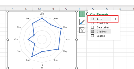
Drag the corner of the chart with the shift key for a perfect square. remove the axis of the chart.

Now we’ll change the chart style by going to chart design.

By clicking the element button of the spider chart, the data label will become visible from the show option of data label.

After the data label becomes visible, add color and font as per your choice. select a value and then go to home tab then select font color and make it bold.

If you are looking at the chart, you will be seeing some values which are overlapped, we will fix them manually so that they do not overlap.


