Welcome to Excel Avon
Full circle KPI Chart in Excel
PLEASE DOWNLOAD USED EXCEL FILE FROM HERE>>
In today’s post we will show you how to Create Full Circle KPI Chart in excel, although it is quite simple, only doughnut chart will be used in this, so it is going to be very easy. The Full Circle KPI chart is an attractive and easily understandable format for presenting Key Performance Indicators (KPIs). KPIs are represented by colored sections of a full circle, and the status of each KPI is shown by an indicator within the chart. This article will show you how to create Full Circle KPI Chart in excel.
Full Circle KPI can also be used in project management, in the same way Data Representation is used, it is used to show the ratio of male to female in census or to show literacy or unemployed or employee logo of a state. This data can be visualized using a full-circle chart. This is a useful tool for presenting data in an attractive way and making it easy to understand.
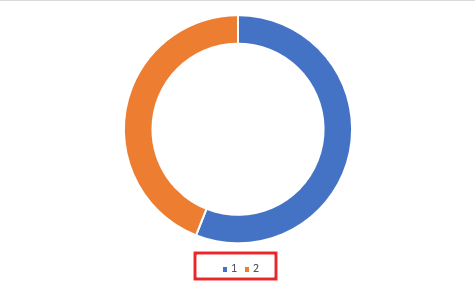
Well, as you can see, our full circle KPI chart is going to be like this.

CREATE FULL CIRCLE KPI CHART IN EXCEL
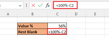
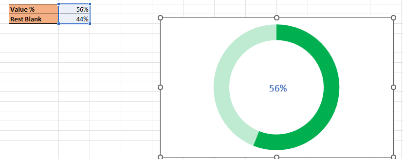
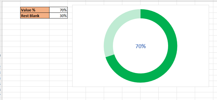
Create a table in excel sheet which will look something like this. In which there will be 2, parts value% and Rest value. Added formula for Rest part. =100%-C2. If you have more data then you can create for that also.
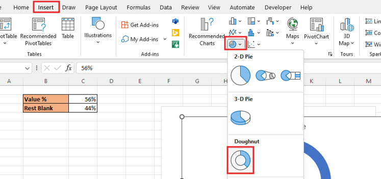
Select the data, go to the Insert, from here insert doughnut chart. Doughnut chart is a chart in Excel whose visualization function is similar to pie charts. Select data> Insert tab> Chart> Doughnut Chart.
To Remove the legend at the bottom, select the legend and delete it. If you are working in a project or making a chart for the project, then you can write the name of that project in the title of the chart.
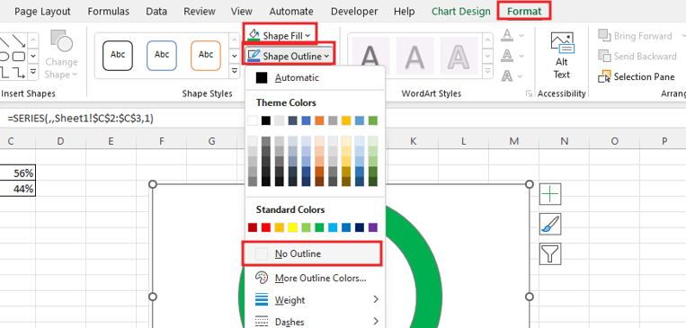
To remove the outline from the chart, going to Format tab. Now go to the Format tab, go to Shape Fill and fill the color of the donut chart, and also make the outline of the chart ‘No Outline‘. As you can see we choose green color for chart
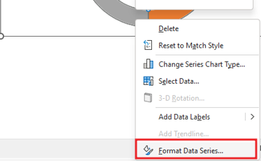
Now right click on rest part and go to Format Data series option.
Now do the color selection for Rest part, for rest part we will select ‘Solid Fill‘ and fill green.

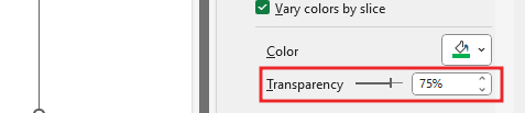
Change color transparency in the second part of the chart, right-click on the chart to go to Format Data Series Select Series Option and change the transparency level to 75%.
.
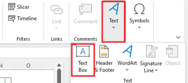
To show Data Label in the middle of the circle, we need to insert a text box or shape, Select Insert in ribbon, click text option then Choose text box drag text box in chart.
Add formula in Text Box =C2. after aligning the text box. Customize text box, Bold, size of font color, size of font.
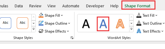
To make the text look good in the text box, you can also add effects to the text by going to the shape format.
Now you can check the chart and change the value.
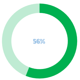
Now our Full Circle KPI Chart is ready.
Therefore, I hope that you have understood How to Create Full Circle KPI Chart in Excel, maybe if you do not understand anything, then you can comment us with the question, which we will answer soon and for more information, you can follow us on Twitter, Instagram, LinkedIn and you can also follow on YouTube.
PLEASE DOWNLOAD USED EXCEL FILE FROM HERE>>
LEARN MORE DASHBORAD AND CHART TOPIC HERE
You can also see well-explained video here about How to Create Full Circle KPI Chart in Excel


