Welcome to Excel Avon
Balloon chart in Excel
DOWNLOAD USED EXCEL FILE FROM HERE>>
In today’s post we will show you how to Create Balloon chart in Excel, although it is quite simple, As the name of the chart is Balloon, there is a bubble chart in Excel, which will be used. Balloon chart is very attractive and innovative in Excel. In charts, we represent data points with the help of bubbles. The higher the data point value, the higher the bubble, and it will eventually be seen at the top of the chart; Similarly, a low value will have a small bubble near the lower Y-axis. This is useful for showing population data. Or use tax to show literacy or income of any state.
If you also wished to express the country’s GDP, you could proportionally enlarge or shrink each plotted data point in the form of a Bubble. Balloon chart is mostly used in business, social, economic, and other fields to study the relationship of data.
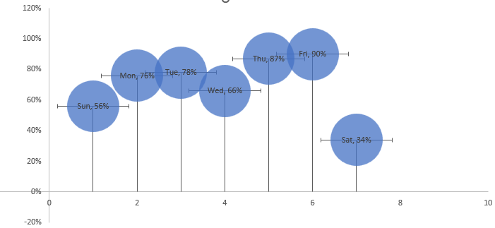
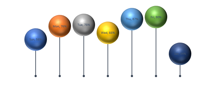
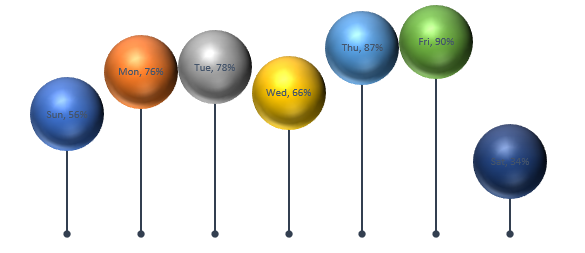
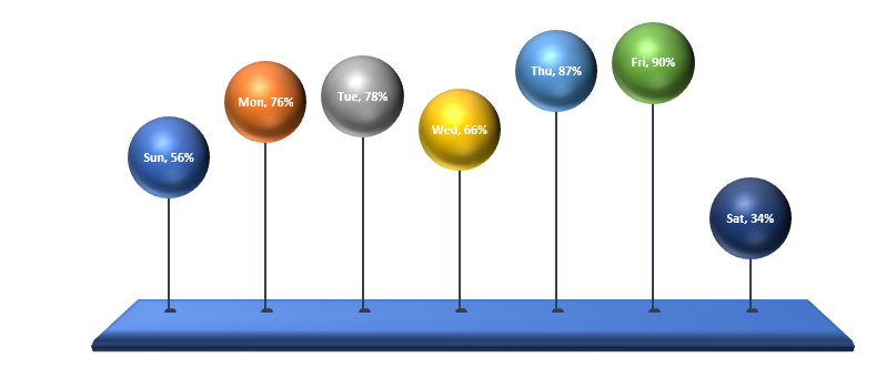
By the way, our Balloon Chart is going to be like this as you can see.
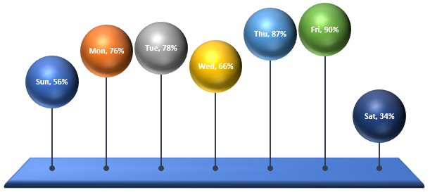
Create Balloon chart in Excel
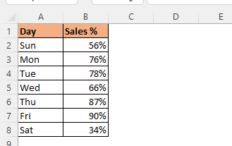
We have some data which looks something like this for which we will create bubble chart.
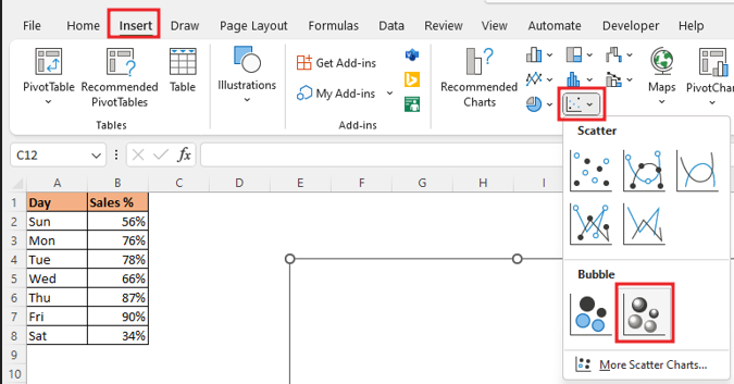
Go to Insert Tab< Scatter chart, click on it. You will see Bubble Chart in the dropdown; select Bubble. Adjacent to that, you also have Bubble with a 3D effect option. I have selected the Bubble option for the below examples.\
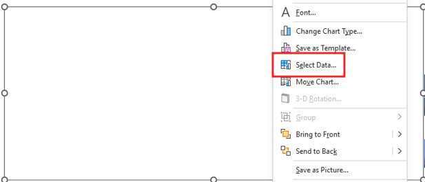
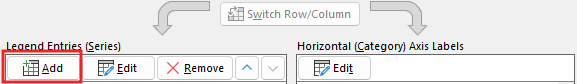
We have inserted the chart, but no data is added to the chart, so right click on the chart and click on the select data option.
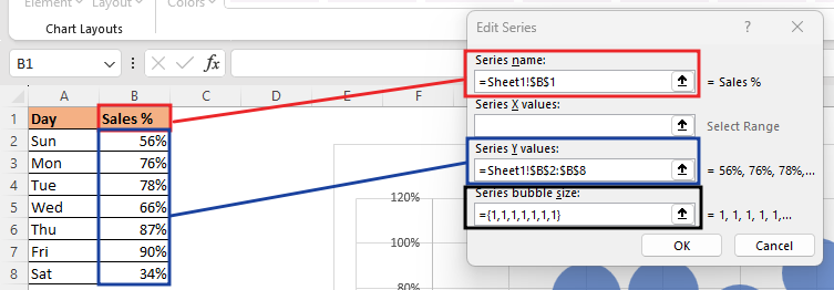
To add data, select a range of ‘cells’ in the series name. Going into Series Y Values, selecting the range of ‘Cells’ in the name and then 7 times 1 (1,1,1,1,1,1,1) for the Series bubble size.
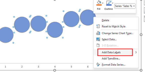
Delete gridline and title from chart. Select the Bubble and Add data label in bubble.
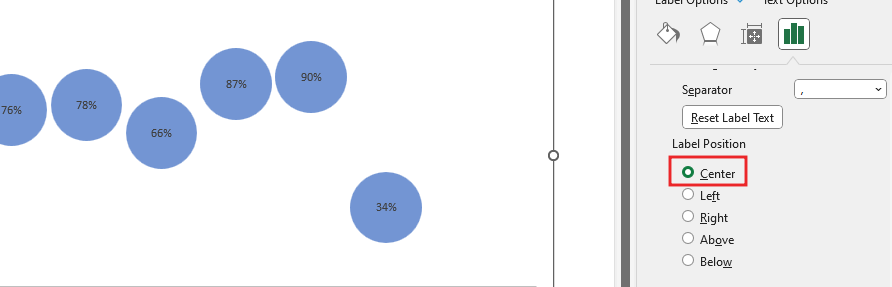
To make the label in the center of the balloon, we will go to the format data label option by right click and will make the label position in the center. Click Value from cell option and select the day’s range.
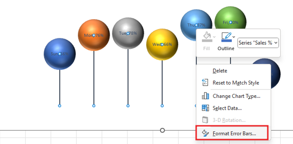
Go to chart elements and Add error bars.
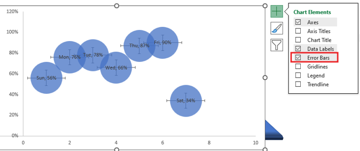
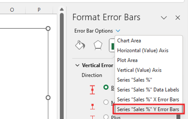
Right click on chart then click on format Error bars option. Going to the error bar option will go to ‘Series Sales % or Error Bars’.
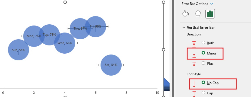
Minus Type for the error bars and End style bars with No-cap style.
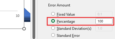
Change the error amount type to percentage and change its value to 100.
Now we’ll increase the size of chart, so that the balloon does not overlay. and Remove the axis from the chart.
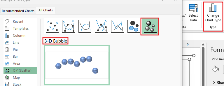
Change the chart type, we will select 3-D Bubble type.
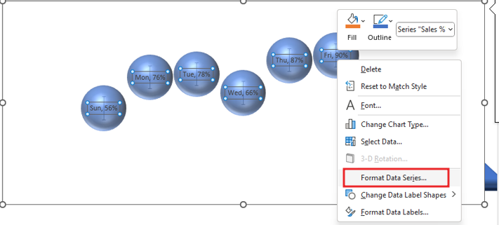
After this we will fill color these bubbles with go to Format data series option,
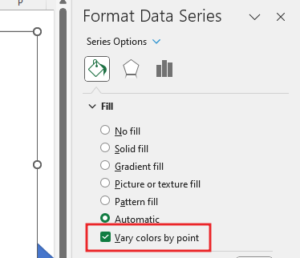
Go to Fill option and select vary color by point option. Select ‘No Line’ by going to Border option.
Now we can change the style of the chart by going to the Chart Design tab.
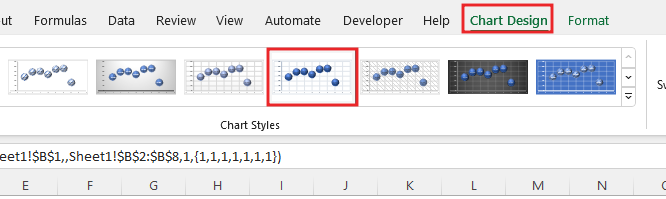
After changing CHART style, remove gridlines and access from chart element option.

Formatting the bars of the balloon, right click on bars and go to format Error bars option. Increase the width of balloon bars.
Change the Bars End Type.

Now you see the bars end Type has Changed.
Select the entire chart and make it No Fill as well as make the border No Fill.

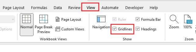
You go to the View tab and untick Gridlines.
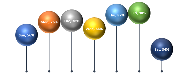
Formatting the value written in the balloon will make the text bold and change the color.
We’ll insert a shape> Illustrations> Shape> Select a rectangle shape and drag the selected shape to the sheet.
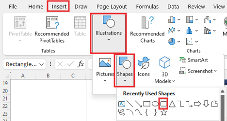
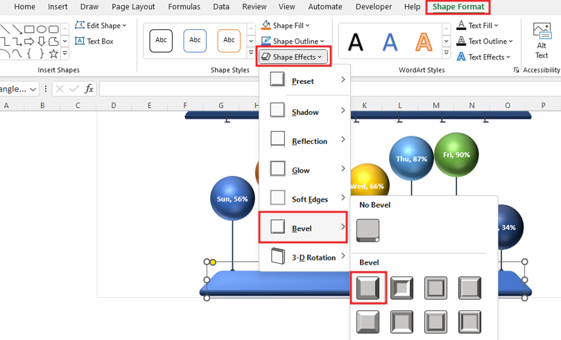
Right click on the shape and go to format shape option, For Effect in shape go to bevel and choose round effect.

Now we’ll add effect in shape by going to shape format option.
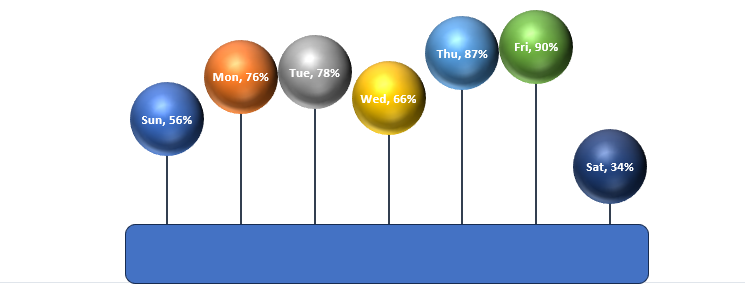
Select rectangle shape and Send the back the shape by right click on shape.
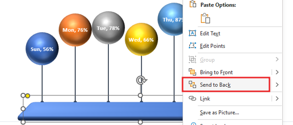
Fit the bars of the balloon in the shape properly.
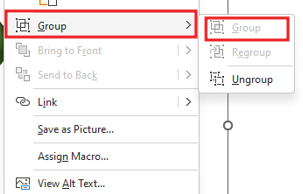
Now select the shape and chart, then right click, from here we will group. In the image you will see group option hide because we have already grouped the shape.
After grouping, you can move the chart anywhere. and this is how the balloon chart is done.
Therefore, I hope that you have understood How to Create Balloon Chart in Excel, maybe if you do not understand anything, then you can comment us with the question, which we will answer soon and for more information, you can follow us on Twitter, Instagram, LinkedIn and you can also follow on YouTube.
DOWNLOAD USED EXCEL FILE FROM HERE>>
LEARN MORE DASHBORAD AND CHART TOPIC HERE
You can also see well-explained video here about How to Create Balloon Chart in Excel


