Welcome to Excel Avon
Bull’s Eye Chart in Excel
DOWNLOAD USED EXCEL FILE FROM HERE>>
In today’s post we will show you how to create a bull’s eye chart in excel, although it is quite simple, excel does not offer a bull’s-eye chart, but with a little trickery you can create an excel scatter chart to show a series of concentric circles. Persuading Excel to generate a proper replication with the plotted data to create a series, learn how to create a bull’s eye chart in Excel through this post.
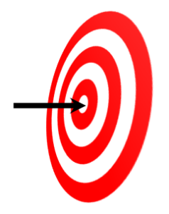
The Bull’s Eye chart is a visual representation of the progress of your targets and data and will be used to see if a weather parameter is in its desired range. I made this chart using donut and 2-d line chart, I hope you can use it.
Well, as you can see, our bull’s eye chart is going to be like this.

Create Bull’s Eye Chart in Excel
Create a data table in excel sheet which will look something like this. In which there will be single value, target value% If you have more data then you can create for that also.

Without Select the data, go to the Insert, from here insert doughnut chart. Doughnut chart is a chart in Excel whose visualization function is similar to pie charts. Select data> Insert tab> Chart> Doughnut Chart.
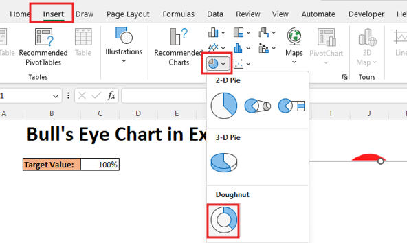
After inserting doughnuut chart, the chart will be inserted but we have not added any data to the chart yet, so the chart will appear.

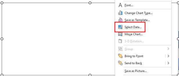
But now we will add data to the chart, so right click on the chart and click on select data option.

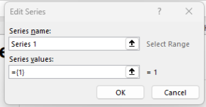
To add data, Give the name of series and do not make any changes in the series value.
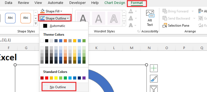
Delete gridline and title from chart. Now go to format option and make the shape outline ‘No outline‘.
Now we will copy and paste the donut chart 5 times.

Now you will see 5 doughnut charts, select any one of them and go to format data series option by right click.
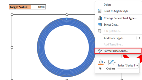
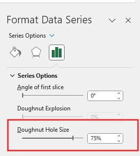
Now you have to reduce the size of the hole in the donut chart.
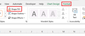
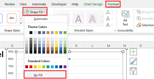
Now you have to do the color formatting of this chart, for which we will go to the Format tab and click on the Shape Fill option.
You can see the image of the chart below; you will have to do the same color fill in the image.

Now copy the chart you have created and paste as picture by right click.
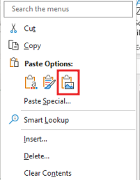
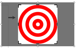
By going to picture format, we will crop the pasted picture chart and after that we have to crop the chart itself. You can see and cut the image attached below. After cropping, you can delete the first created chart.

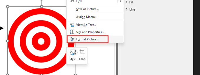
Now go to picture format by right clicking.
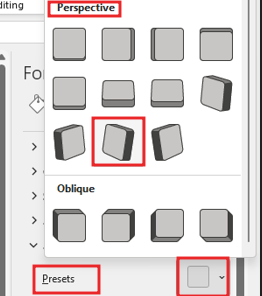
Now we add 3-D Rotation the effect in Picture as shown in the image below.In 3-D rotation go to perspective effect and add turn left tilted up.

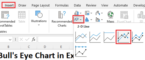
Select the data, go to the Insert, from here insert 2-D Line chart. Select data> Insert tab> Chart> 2-D Line chart.
Delete Legend and title from chart. Now go to format tab ‘No Fill’ with Shape Fill. No outline with shape Outline
Now you will go to insert tab and go to arrow shape.

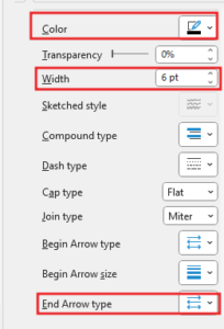
Now drag the shape, then by right clicking on the shape, go to Format Shape and increase the width, then fill the color solid and change the arrow type.
Now you will cut the arrow Press (Ctrl + X) and select the point of the line chart and paste (CTRL + v) it. Axis value is up to 120 so we will do value 100.

Now we will fit this arrow in the chart properly.

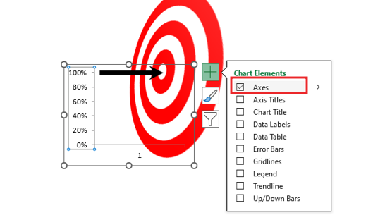
Delete the axis by going to Chart Element option.
Now select the shape and chart, then right click, from here we will group. In the image you will see group option hide because we have already grouped the shape.
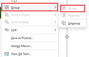
After grouping, you can move the chart anywhere. and this is how the balloon chart is done.
Therefore, I hope that you have understood How to Create Bull’s Eye Chart in Excel, maybe if you do not understand anything, then you can comment us with the question, which we will answer soon and for more information, you can follow us on Twitter, Instagram, LinkedIn and you can also follow on YouTube.
DOWNLOAD USED EXCEL FILE FROM HERE>>
LEARN MORE DASHBORAD AND CHART TOPIC HERE
You can also see well-explained video here about How to Create Bull’s Eye Chart in Excel


