Welcome to Excel Avon
Conditional Progress circle Chart in Excel
DOWNLOAD THE USED EXCEL FILE FROM HERE>>
In today’s post we will explain how to create a conditional progress circle chart in Excel. As I told you, to create a progress circle chart in Excel, we have to use a donut chart because no progress circle chart exists in Excel, The Progress Doughnut Chart shows the percentage of progression of a task.
You can easily make this chart in Excel. This chart displays a progress bar with the percentage of completion on a single metric. We’ll apply conditional formatting so that the color of the circle changes as the progress changes. This technique uses only donut charts and formulas. It is quite easy to implement.
So today in this article, I will explain How to create Conditional progress circle chart in Excel step by step with pictures.
Well, as you can see, our Conditional progress circle chart is going to be like this.


Create Conditional Progress Circle Chart in Excel
As today we are going to make a progress circle chart where there is some data like this, this data has been kept in three parts: Level 1, Level 2 and Level 3. We have fixed the value of Level 1 from 0 to 40. If in the progress cell If the value is between 0 to 40 then it will be considered as level 1 and after this for level 2 we have fixed it from 41 to 75 and then after level 2 for level 3 we have fixed it from 76 to 100. As you can see below.
Now we will add condition in the cell for level 1 if the value of C2 is equal or less than C5 then the value of C2 will come otherwise the cell is blank. also make C2 absolute cell.
Now we will add condition in the cell for level 2 here we are adding two conditions if the value of C2 is equal or less than C6 and the value of C5 If both conditions are true then the value of C2 will come otherwise the cell is blank. also make C2 absolute cell. We will add this condition for level 3 also and drag it.

Remaining value will be obtained =100%-C2

After this you can check the chart by filling the values to see whether the condition is perfect or not. then insert doughnut Chart without selecting data.

There is no data in the chart after the chart is inserted, so now we will go to select data by right clicking.

From select data, we will click on add button and then write series name and series value here, name the series as Series Cell, then select the Series Column cell for the series value.

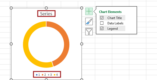
You can manage the elements of the chart as per your need because if you want to give a chart title, then give it, otherwise you can remove it. After this, the same has to be done with the legend, however, we have deleted it from here.

Now we will fill a value in the progress cell, this value will be of level 1, hence we will fill the color in the chart for level 1. Select the entire chart and make no lines from the outline of the chart and then color the level 1 part as you want to select. Along with this we will color the remaining part.

To add a text box to the chart, go to the Insert tab and then drag the text box.

Add formula to print value in textbox =D5.

Create three text boxes by copy pasting and add the value of D6 for level 2 and D7 for level 3 to one of them. Maybe you are not seeing the value in text box 2 and 3. The reason for this is that the value will appear here only when the key value of the progress cell is at level 2 and level 3.

After Adding the formula when value is print in Textbox, aligning the text box. Customize text box, Bold, size of font color, size of font.

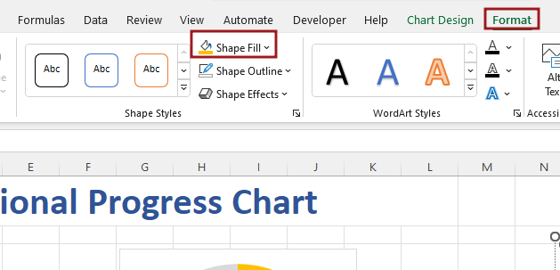
After formatting text of the text box, we have to see the color of the chart, that is, when there is a value in level 2, it changes, and you select the color to be changed. Go to the format option and select the color from the shape fill here.

Now we will satisfy the value of progress cell from level 3 but the color is not looking right in the chart, so we will go to format option and select green color from shape fill and then remove the outline.

Now select all text boxes, aligning all the textbox Middle.

Now select all the text boxes and make their shape fill no-fill and then make their outline no-line.

Let’s check the chart by changing the values. Here the value of level 2 range has been filled and now you can see the chart is showing level 2.

Similarly, the value of level 3 range has been filled and now you can see the color of the chart has changed and the value is also showing. Now our Conditional progress Circle chart is ready in Excel. change the value of progress cell then you can see chart has been changed.

Therefore, I hope that you have understood How to Create Conditional progress Circle chart in Excel, maybe if you do not understand anything, then you can comment us with the question, which we will answer soon and for more information, you can follow us on Twitter, Instagram, LinkedIn and you can also follow on YouTube.
DOWNLOAD THE USED EXCEL FILE FROM HERE>>
LEARN MORE DASHBORAD AND CHART TOPIC HERE
You can also see well-explained video here about How to Create Conditional progress Circle chart in Excel


