Welcome to Excel Avon
Waffle chart using the Bars chart in Excel
DOWNLOAD THE USED EXCEL FILE FROM HERE>>
In today’s post we will explain How to Create Waffle chart using the Bars chart in excel. Excel waffle chart is a popular way of displaying parts of a whole. Just like we taught you how to create a Waffle chart with conditional formatting, today we will use a 2-D Clustered Bar chart to create a Waffle chart. Waffle charts are square or rectangular displays made up of smaller squares in a grid pattern.
Most commonly, it is a 10 x 10 grid, but they can be any dimension you want them to be, and this will depend on the data you are looking to display. Each square within the grid is colored based on a category and represents a portion of the whole. From these plots, we can see contributions of individual categories.
Waffle charts are a great way to visualize categorical data, are aesthetically pleasing and easy for readers to understand — which is one of the key goals of effective data visualizations. They also provide a nicer looking alternative to pie charts.
So today in this article, I will explain How to Create Waffle chart using the Bars chart in excel step by step with pictures.
Well, as you can see, our Waffle chart using the Bars chart to be like this.
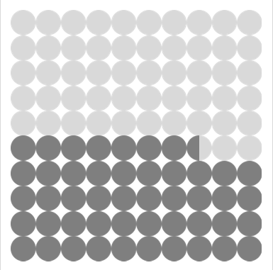
Create Waffle chart using the Bars chart in Excel
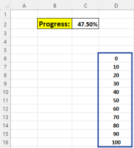
Create a cell in the Excel sheet where the data contains the displayed value, or we can use it as a display cell which will look like this. No formula has been added here. just a simple value.

Now you have to write the values. Last time we wrote a lot of data. Today we will change the way of filling the values and as we said above, it adds up to 100% by using a grid of 10 x 10 cells. Our data will be something like this.
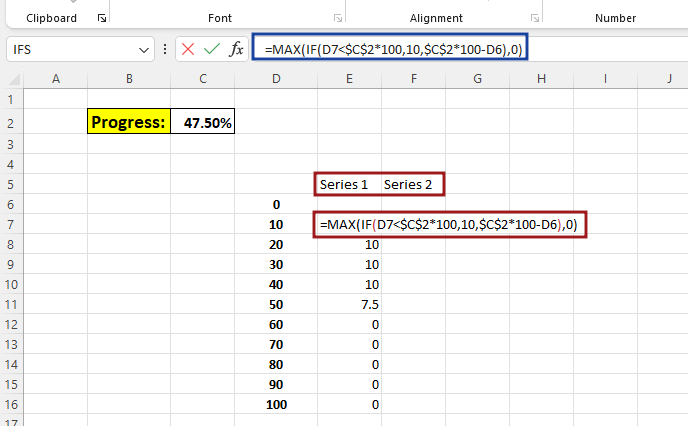
Now we have to declare columns for two series which will be Series 1 and Series 2. And then we will add formula in series 1, this will be a logical test. If the value of D7 is less than the value of C2. If the logic is true, then value 10 will be filled. If the logic is incorrect then the value of cell C2 will be subtracted. We need this value in percentage so we will multiply 100 with C2. We will turn off the parameters of the logical test and then use the max function in it. After adding the formula, drag it across the entire column.
=MAX(IF(D7<$C$2*100, 10, $C$2*100-D6), 0)
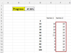
Now we will write 10 in all the cells of series 2 column.
Now without Selecting data go to Insert tab and click on insert Bars chart. insert Clustered chart from 2-D Bar.
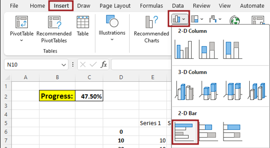
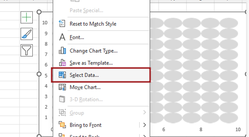
There is no data in the chart after the chart is inserted, so now we will go to select data by right clicking.
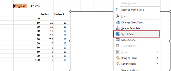
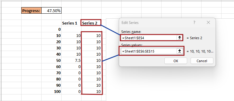
From select data, we will click on add button and then write series name and series value here, name the series as Series2, then select the Series 2 Column cell for the series Value.
Delete the chart title and then Right click on axis then go to Format axis.
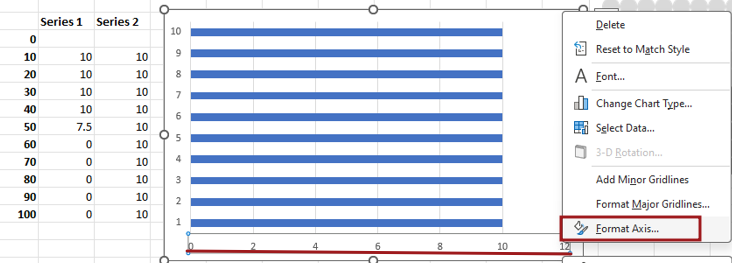
Now we will change the bound value of the axis. Now here we will change the max bound from 12 to 10.
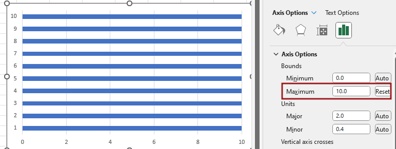
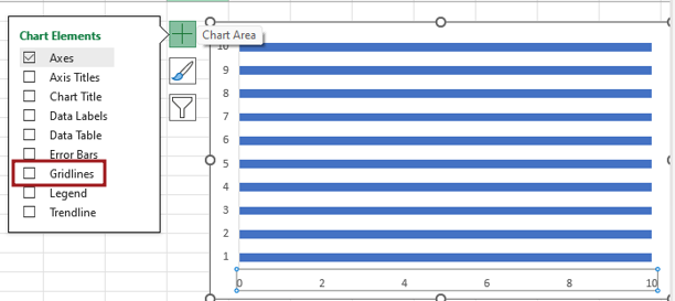
Now we will remove some elements which are not in use or are making our chart look bad.
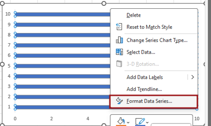
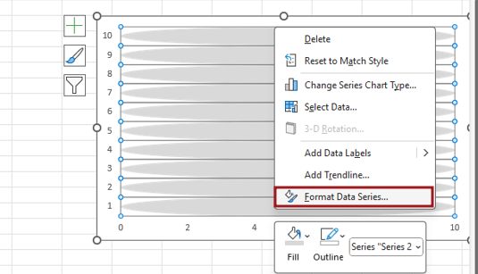
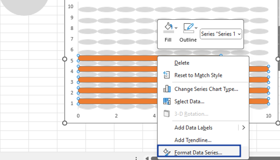
To format the bars, we will select the bars, then right click and go to the Format Data Series option.
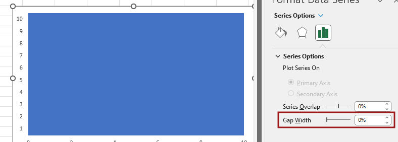
And then we’ll decrease the gap width to eliminate the gap between the bars.
Now you have to insert a shape, then you go to the Insert tab and then go to Illustration and then to Shape, then you insert an oval shape.
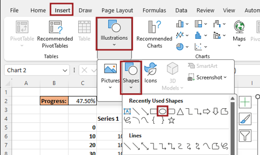
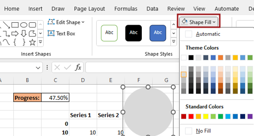
After inserting the shape, you drag it with shift key for perfect circle. Then fill the color with No outline.
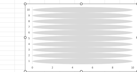
Now the circle shape that has been created will be replaced with the bars of the chart.
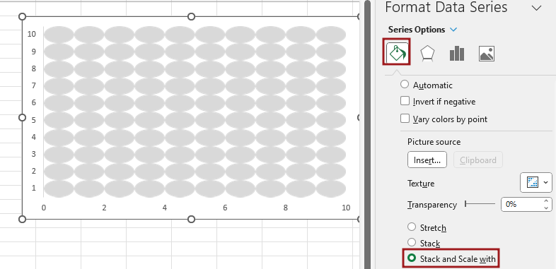
To format the data series, then right click shapes and go to the Format Data Series option.
In Format Data Series, go to Fill option and select Stack and Scale with option.
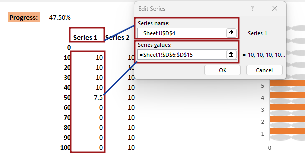
From select data, add another data series we will click on add button
Write series name and series value here, name the series as Series 1, then select the Series 1 Column cell for the series value.
Formatting of the series by right click on the bar.
Overlap the series bars.
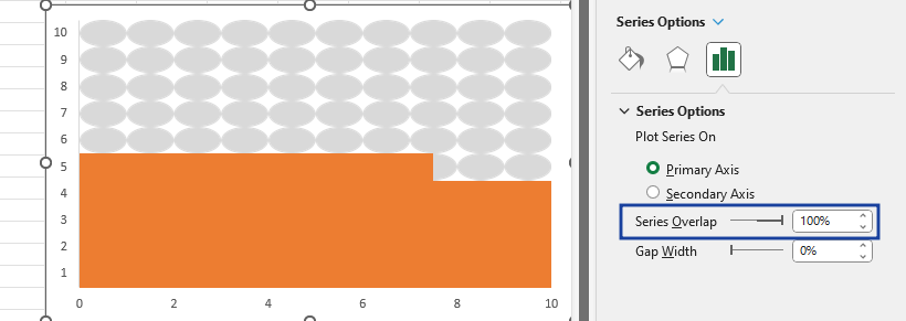
Now the circle shape that has been created will be replaced by the bars of the chart. But before replacing the color will have to be changed
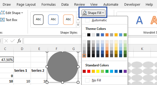
After changing the circle color, we will paste it in place of the orange bars of the chart.
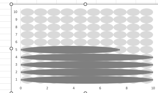
Chart shape will have to be formatted after replacing.
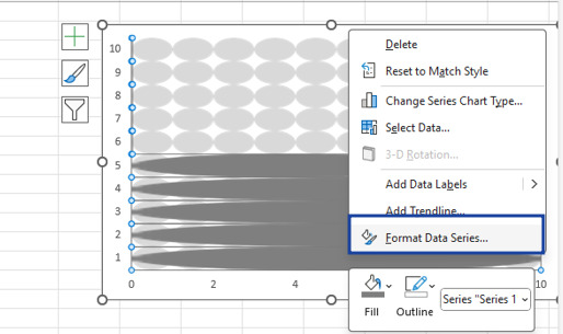
In Format Data Series, go to Fill option and select Stack and Scale with option.
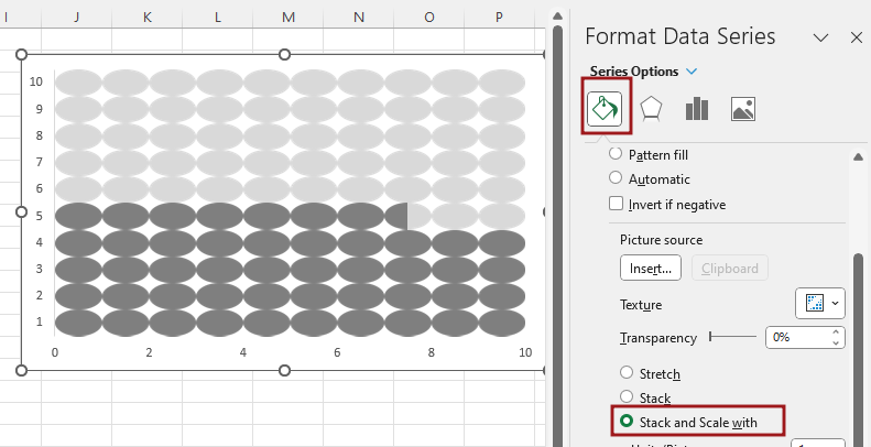
Now you will adjust the length and width ratio of the point shown in the chart.
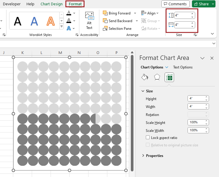
Now our Waffle chart using the Bars chart is ready as you can see and if you want to make some changes in it as per your understanding then do so.

Therefore, I hope that you have understood How to Create Waffle chart using the Bars chart in Excel, maybe if you do not understand anything, then you can comment us with the question, which we will answer soon and for more information, you can follow us on Twitter, Instagram, LinkedIn and you can also follow on YouTube.
DOWNLOAD THE USED EXCEL FILE FROM HERE>>
You can also see well-explained video here about How to Create Waffle chart using the Bars chart in Excel,


