Welcome to Excel Avon
Speedometer graph chart in Excel
DOWNLOAD THE USED EXCEL FILE FROM HERE>>
In today’s post we will show you how to create a speedometer graph chart in excel, although it is quite simple, a speedometer chart is a graph. Speedometer graph Chart is a gauge where a needle points to the values at a certain point of time. Users create Speedometer Chart in Excel to track value change. There is no direct feature to create a Speedometer Chart in Excel. We need to insert a Combo Chart to create a Speedometer Chart.
A gauge chart with a needle indicating the ongoing change in values is known as the Speedometer Chart. It’s the same as that of a speedometer in a bike or a car. In this article, we will learn how to create a dynamic speedometer chart in excel.
You can see how our speedometer graph chart will be made like this.
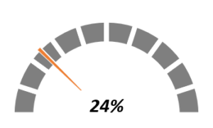
Create Speedometer graph chart in Excel
Here 3 cells are created where we will set the value to show cell, needle size cell and remaining meter value cell.

Here we write some value, suppose we want to show 24, we take the Needle point as 1%.
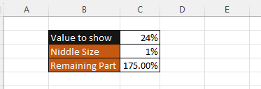
Add the formula, for the remaining part. subtract the value of value to show cell and the value of the needle size bye 200%
=200-Sum(C2:C3).

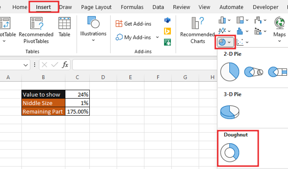
To insert a chart, go to the insert tab. insert Doughnut Chart. The chart will remain blank after the insert because the data has not yet been added to the chart.
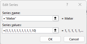
To add data, we will right click in the chart, then go to the select data option in the chart. In select data source we’ll click on Add button.


Give the name of series whatever you want and give the data , Here we’ll write total 10 time 1 and in the last we will write 10 once.
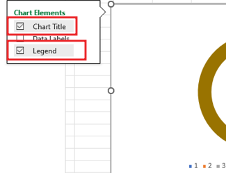
Go to the elements of the chart, then remove the title and legend from chart.
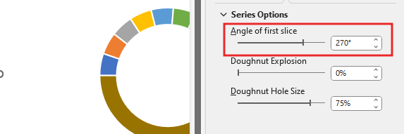
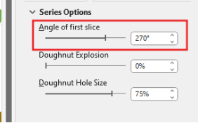
Then we will do the Data series formatting of the chart by right click on char, change the angle of first slice to 270 Degree.
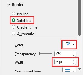
Now we will do color formatting for the chart. Here we will select the solid line for the border and make the border color white and increase the width of the border.
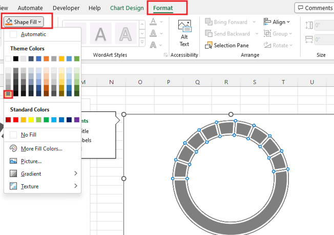
Now we will go to format tab and here we’ll go to shape fill now we will change the color of the chart from here. here the color of the chart is gray.
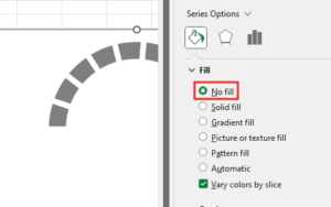
Now we will make the lower part invisible by color formatting.
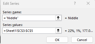
We will add needle to it right click on chart. Again, we will go to the chart and then again in the chart we will go to the select data option. This will give the name of the series and select the cell for series value.
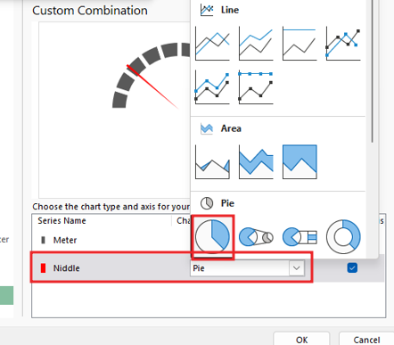
By clicking, on the letter chart, you will change the type of the chart.

Pie chart selected for needle chart.
Change the direction of the needle chart that has been made.
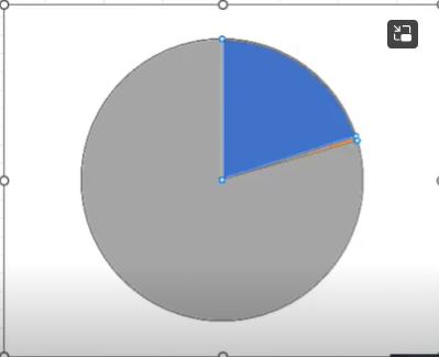
Then we will do the Data series formatting of the chart by right click on needle chart, change the angle of first slice to 270 Degree.
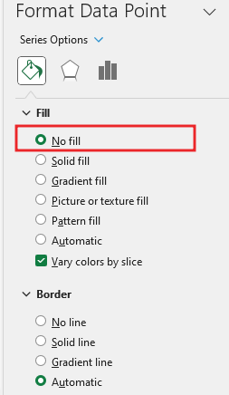
Make the value to show part and the remaining part invisible by filling no color. Here only the needle part will be kept. No line selected needle border.
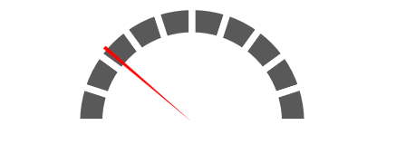
you can change the needle size from here. set the needle size to 1.

If you change the value of the value to show cell, then the meter will keep changing. The Direction of the needle changes when the value changes.

Insert the textbox by going to the insert tab. drag the textbox in chart, add the formula for textbox =C2. Make shape outline No Outline. Fix the text box in the speedometer graph.
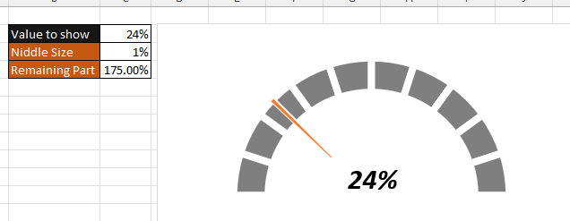
Let’s check the speedometer graph.
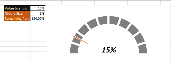
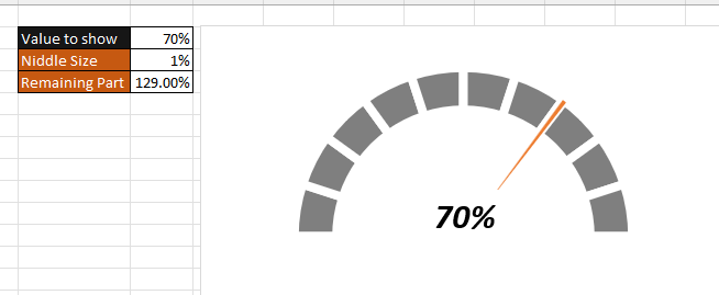
Therefore, I hope that you have understood How to Create Speedometer graph chart in Excel, maybe if you do not understand anything, then you can comment us with the question, which we will answer soon and for more information, you can follow us on Twitter, Instagram, LinkedIn and you can also follow on YouTube.
DOWNLOAD THE USED EXCEL FILE FROM HERE>>
LEARN MORE DASHBORAD AND CHART TOPIC HERE
You can also see well-explained video here about How to Create Speedometer graph chart in Excel


